visual search on bing
year
2025-2026
TOOLS
Figma, Claude Code, UX Labs
team
1 designer, 2 PMS, 11 engineers,
cross geo collaborators
project context
Search by image has moved from novelty to default behaviour. The market bears this out: Google Lens now handles 20 billion visual searches a month, and image-based queries account for over a quarter of search volume.
Visual Search launched on Bing in 2018, but it remained a standalone feature, confined to the Image Detail Page. This created an opportunity to reimagine Visual Search as a native search modality embedded throughout the Bing experience.
my role
I led the experience design for Visual Search as a multimodal experience on bing— identifying relevant touch-points, defining scalable design principles and shaping multimodal results that combined visual intent with traditional search. I partnered with cross-functional teams to align on solutions that could scale across Bing surfaces.
visual search currently has 13.6M.
the problem
01
powerful, yet UNDISCOVERABLE
Visual Search lived outside the primary search experience, so users rarely discovered where to use it
02
Text-first search results on BING
Search led with text input and results even when user's intent was clearly visual
03
untapped capability
Visual search could identify entities, translate, show similar images, and more — but most users DIDN'T KNOW IT could do so many things
PROJECTS & impact
01
The SERP intercept
Building visual search experience on Bing SERP page.
Projects: Visually similar answer; Pages including answer; Translate answer; mobile and Edge Right Pane; Flyout improvements
My Role:
Product northstar planning, designing multi-modal answers, data-informed decisions, interaction design, cross-functional partnership, and influencing product strategy.
Impact:
Shipped - 3 answers - Visual search overview tab, Visual matches improvements, Pages including answer
Translate answer is under development.
WPSBS reduced 3x
Visual Search on Edge right pane, resulting in a DAU gain, PCR lift, and increased dwell time.
Visual matches design improvements resulted in imporvements in Answer clicks/UU, Click to image vertical, Image engagement
02
Design for discovery (at the right moment)
Defining entry points for visual search
Projects: VS on video, VS on SERP, VS on IDP
My Role:
Landscape study, Scalable design, data-informed decisions, interaction design, cross-functional partnership, and influencing product strategy.
Impact:
Shipped - 2 new entry points and established a hover framework now being scaled across multiple Visual Search surfaces. Contributed to growth initiatives that are estimated to add +400K daily active users.
IRP hover: WAU gain; PCR: >33%
SERP hover: WAU gain
Mobile SERP Visual Search entry point PCR: over 60%
03
Expanding how users start an image search
Exploring input modalities.
Projects: Visual Search actions on Search bar - Paste image in Search bar; Drag and Drop image
My Role:
System thinking, end-to-end flow design, rapid prototyping and influencing product direction
Impact:
Positive DSQ/UU, Session Success Rate
PROJECT 01
The SERP intercept
Help users go beyond visual matches and explore the wider range of things visual search can do,
while giving them an instant sense of what the product offers.
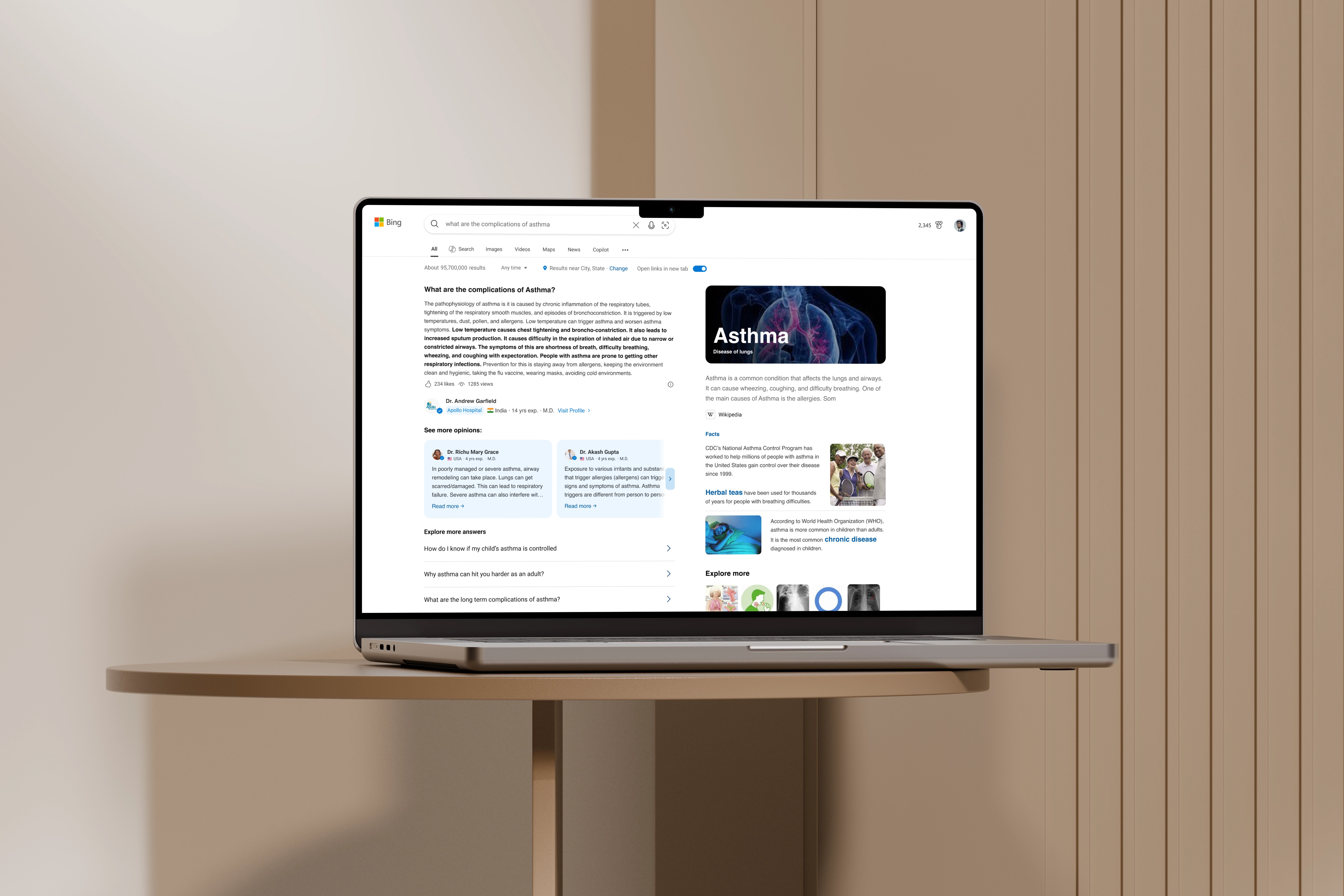
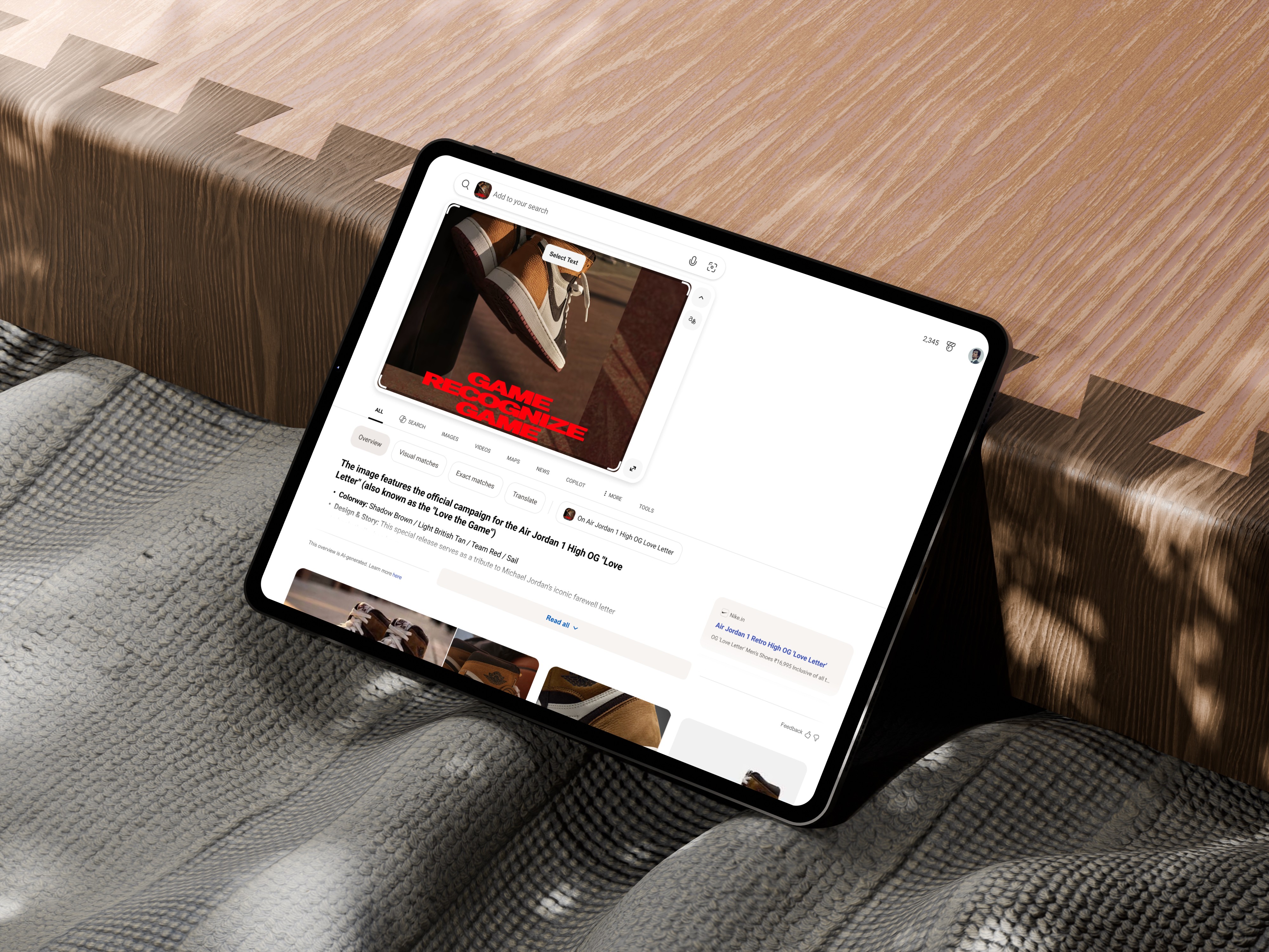
Visual Search Results - on Bing SERP
"I can search any image and get answers right there — no need to describe it, start over, or type out what I mean"


design goal:
the main goal for this project was to build an instant sense of what the product is about.
Tabs at the top show every way to explore the image, such as general overview, translating text, and finding similar images. The results below let users dive into whichever one matches their intent.
the design approach:
Moving visual search into the spotlight
Visual search earlier lived only inside the image detail page. Moving it onto the Bing results page meant it had to fit the framework of SERP answers and make sense at a glance.
I worked on defining how these answers rendered, from navigation and layouts to magazine versus mainline views and multi-modal interactions.Opening a path to shopping
With product, I iterated on select answers to explore how visual search journeys could lead naturally into shopping, turning curiosity about an object into a way to find and buy it.Extending the framework
The new answers needed layouts and interactions the search design framework didn't yet support. I worked with the core framework team to align on the designs and build these patterns into the framework, making them reusable beyond visual search.data driven decisions
The answers had to be designed around real data. Data availability varied for different content types, and every answer had to fit within the layout constraints of the Bing framework. Close collaboration with the product team clarified those constraints, which metadata was always available, and how information and click-outs should be ordered. This shaped the final design recommendation, framework expansion and the trade-offs behind it.
the impact:
VNext visual matches delivered imprOved RICHER EXPLORATION AND IMPROVED user interaction metrics:
the new design Surfacing 2x more visual matches directly on SERP, reducing unnecessary navigation improving content discoverability, overall good PCR, Click to image vertical usage, query success rate; improved content discoverabilityDESIGNED ALL MOBILE ANSWERS WHICH updated the design for EDGE RIGHT PANE EXPERIENCE FOR VISUAL SEARCH ON DESKTOP, with a substantial lift in OVERALL PCR, this helped improve overall serp coverage and IMPROVEMENT IN REVENUE/UU.
INTRODUCED CRAFT UPDATES TO EXISTING EXPERIENCE AND ADDED ANSWER CARD INTERACTION FORMAT TO BING LIBRARY
Giving intent a home (translate answer) -
Translation was first built into the image upload flyout, a temporary panel that closed as soon as the user moved on. I pushed for a dedicated translate answer instead, so people who wanted to understand text in an image had a proper destination rather than a passing moment.
Prototype tool: VS code + Claude Code
PROJECT 02
Design for discovery at the right moment
The answer to discovery wasn't adding visual search everywhere.
It was surfacing it at the moments when users would naturally want to use it.
FRAMING THE PROBLEM:
DESIGNING FOR MOMENTS of curiosity, NOT PLACEMENTS
As visual search matured, the obvious next step sounded simple: add it everywhere. We reframed the question. The experience needed to appear when it was useful, not everywhere it was possible. I worked with product to define an ecosystem-wide entry point strategy that mapped where and how visual search should surface, based on user intent, content context and each canvas's goals.WHERE DOES VISUAL SEARCH ACTUALLY BELONG and how do users engage with it?
I built a point of view grounded in user value by synthesizing competitive analysis, trend data and emerging user behaviors. I turned the findings into opportunity areas and implementation canvases that made each direction tangible and comparable.WHERE DO USERS ALREADY WANT TO SEARCH VISUALLY
I audited the Bing ecosystem to find high-impact canvases where users naturally engaged with visual search, prioritizing moments where it could deliver real value and drive adoption.
THE OUTCOME:
This research and exploration fed into cycle planning and informed what the team prioritized including - from video to visual search; from image browsing to visual search; visual search magazine concept
Shipped 2 new entry points and established a hover framework now being scaled across multiple Visual Search surfaces. Contributed to growth initiatives that are estimated to add +400K daily active users.
IRP hover: WAU GAIN; PCR: >30%
SERP hover: WAU GAIN
Mobile SERP Visual Search entry point WAU GAIN; PCR :>60%
Video → Visual Search
"I saw the perfect pair of shoes in a video — but there was no way to actually find them."
Prototype tool: VS code + Claude Code
design goal:
Let users search for people, places, or objects in a video without interrupting what they're watching.
the design approach:
the opportunity
A viewer spots a jacket in a video. Or a landmark. Or a gadget they've never seen. Today, finding it means pausing, leaving the video and guessing at search terms.
That gap between seeing and knowing was the opportunity.LEARNING FROM THE LANDSCAPE
I benchmarked video commerce, visual search and multimodal AI experiences, mapping interaction patterns for product and entity discovery in video. To make this research repeatable i built a Claude skilldefining the QUESTIONS SHAPED THE STRATEGY
What should visual search identify? When should it appear? Where should it surface? How should users move from watching to exploring?questions and constraints
Because the video player came from a third party, I also reviewed its UI guidelines. Those constraints narrowed down which canvases we could design on and focused the exploration on flows that would feel natural within them.SETTING THE PRINCIPLES
The video is the main event. Visual search had to play a supporting role. I established design principles so it could meet moments of curiosity without breaking the viewing experience and scale across canvases.EXPLORING THE MODELS
I explored interaction models across trigger points, placements and navigation patterns and built high-fidelity interactive prototypes with Claude Code to simulate the end-to-end experience, enabling realistic stakeholder reviews and early engineering feasibility discussions.
Built Claude skill for compete analysis & preliminary research
REUSABLE ARTIFACT:
I turned my process into a Claude skill, a reusable workflow that anyone on the team could run. Given a product or experience, it.
captured how visual discovery was triggered, surfaced and navigated
tagged each pattern by interaction type, placement and user intent
documented results in a consistent format, so findings were easy to compare side by side
tagged sources and user review data
Image browsing → Visual Search
"I found the perfect sofa in a photo — I just don't know how to find more like it."
Prototype tool: Figma
design goal:
Some users want a quick glance, others want to act. The experience needs to serve both.
the design approach:
the opportunity
People browse images for many reasons: inspiration, shopping, learning, translating. Some are just looking. Others are ready to act. The challenge was telling the difference, and designing for both.UNDERSTANDING INTENT
I ran a survey to uncover users' primary and secondary intents while browsing images, and where visual search let them down. Two insights stood out. Users had distinct mental models for hovering versus clicking on an image. And to translate text, many were taking a longer workaround because the direct path wasn't visible.intent sets the depth
I defined design principles for surfacing visual search through contextual, low-friction entry points, matching the depth of exploration to the user's stage in the funnel.
A consistent icon to start the journey, A hover preview for the curious, icons that change based on type of image
how does it scale to different intents:
visual search has multiple skills, based on the image, it can smartly show the relevant icon. For example solve and translate will have a different icon that stays consistent for all visual search flows.
the shimmer and entity detection feature only shows progressively when user hovers over the image to prevent feature clutter at the beginning of the funnel.

impact:
iRP hover, SERP HOVER: WAU gain in ~ expected 300k; PCR: >30%
Image segmentation → Visual Search
"I love these jeans on this celebrity — I just want to find a pair like them."
Prototype tool: VS code + Claude Code
INITIAL BRIEF:
Visual Search receives the majority of its traffic from this entry point making it one of the most critical surfaces in the experience.

Media canvas:
User voice:
"How do i turn off the image highlight and search? The interface is horrible"
"there is this very useless shiny thing over the image that prevents me from copying it"
The shimmer segmentation was distraction and affecting primary action of navigation and image copying
This accounted for BIG CHUNK OF dsats on mm
reframing the problem:
the original brief - ADOPTION ISN'T APPROVAL
How can we naturally redirect users to the new vs experience on serp for them to be able to avail all visual search functions.
on further investigation, we found user feedback highlighted recurring UX issues with the existing interaction
The numbers said visual search was a success. Users said otherwise. Something in the experience was working against the people using it.LOOKING BENEATH THE METRICS
I partnered with the surface-owning team to synthesize user signals and behavioral metrics, uncovering the root causes behind the gap between usage and satisfaction.WHAT USERS WERE TELLING US
Interactions felt ambiguous. Visual treatments felt intrusive. Users felt out of control.
I translated each insight into a clear design objective, shaping the experience strategy and design principles.
the design approach:
carrying user insights into design principles
The brief was to boost engagement and handle redirection. But more clicks wouldn't fix a frustrating experience.
We redefined success: an entry point that felt intuitive, predictable, user-controlled and non-disruptive. image segmentation layer opens only when users choose it, visual search tooltip hints at where the click would take them.PROTOTYPING THE POSSIBILITIES
I explored multiple interaction models and prototyped them with Claude Code, validating end-to-end behaviors, patterns and transitions before implementation.
DECIDING TOGETHER
I facilitated cross-functional design reviews with product, engineering and partner teams, weighing each concept across user value, feasibility, scalability, complexity and business impact.ONE PATTERN, BUILT TO LAST
I drove alignment on the final proposal, balancing discoverability with usability and establishing a scalable interaction pattern for future visual search experiences. Being noticed got users to click. Being respected would bring them back.
INTERACTION:
PROJECT 03
Rethinking input mechanisms
Reduce the friction of searching visually by rethinking input mechanisms
Paste Image in Search-Bar
"It's cumbersome to save an image THEN UPLOAD IT to make a query, I wish I could just paste it"
Prototype tool: VS code + Claude Code
the design approach:
The problem
Copying and pasting is one of the most natural ways people share screenshots and images, but Bing didn't support pasted images as a search input. An engineering experiment confirmed strong demand for it, but it also hurt key quality metrics, including query reformulation and DSAT. I was tasked with designing the end-to-end image paste experience, making it easy to use while keeping it clear, predictable, and part of a cohesive multimodal search journey.Exploring directions
I explored several ways to introduce image search from the clipboard, weighing how discoverable each would be, how familiar it would feel, and how well it would fit into Bing's existing search workflow.Defining the interaction model
I mapped the full flow, covering user journeys, system states, edge cases, and failure scenarios. The goal was a robust, predictable experience that behaved consistently with the existing search bar patterns on the results page.Prototyping with engineering
I built interactive prototypes to validate the key interactions and ground design discussions with engineering, which sped up feasibility assessment and implementation planning.
the impact:
with the new design, the user query reformulation was addressed and the experience was shipped.
The flight showed revenue gains with >200K IMAGE PASTED
INTERACTION: